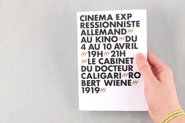
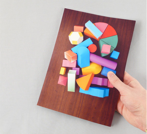
fun shapes via Nevver
fun shapes via Nevver
The Book Cover Archive has officially sold-out. We’ve been made a generous offer by Fusion Ads and have decided to run with it. A couple things about this:
- Fusion ads are small and, hopefully, relevant. I’m pleased to say that most of their ads might actually be of use to you. (ok, Clarus, the pet-tracking-service, might be a bit of a stretch. But still.)
- Now that we’re making money off your eyeballs, I’ll feel too guilty to not do a better job of updating the site. So you can expect a bit more attention to be thrown at this beast.
That’s it!
Feedback welcome.
Novelist Nicholson Baker has written a review of the Kindle — and the iPhone Kindle app — for the New Yorker. Much to my surprise, he prefers the iPhone version:
The problem was not that the screen was in black-and-white; if it had really been black-and-white, that would have been fine. The problem was that the screen was gray. And it wasn’t just gray; it was a greenish, sickly gray. A postmortem gray. The resizable typeface, Monotype Caecilia, appeared as a darker gray. Dark gray on paler greenish gray was the palette of the Amazon Kindle.
This was what they were calling e-paper? This four-by-five window onto an overcast afternoon? Where was paper white, or paper cream? Forget RGB or CMYK. Where were sharp black letters laid out like lacquered chopsticks on a clean tablecloth?
I’m beginning to suspect that e-ink is a bit overrated, and ebooks are going to wind up being another application of our omnipotent jesus-phones.
I really just brought this up because I wanted to plug his first novel, The Mezzanine. Any readers with even a passing interest in industrial design should run and get a copy. Or, you know, just sit there and order it. (note: not available for the Kindle)
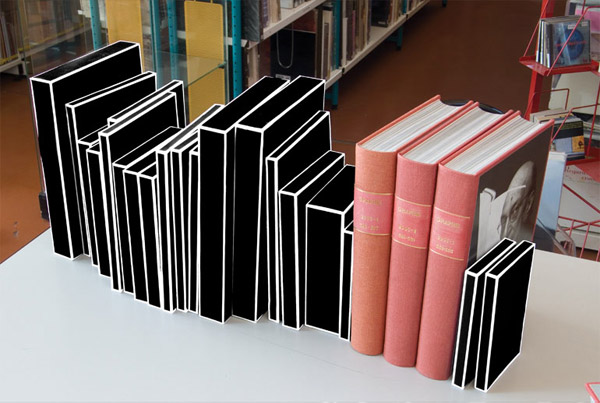
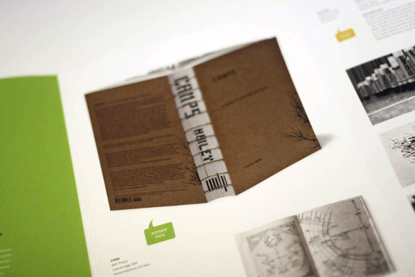
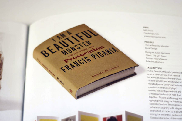
Congratulations to Alex Camlin and Emily Gutheinz for dominating this years BoNE show, with Camlin making no less than 4 appearances and Gutheinz brining home the Judges Pick.
The catalogs from the award show just came out. A handsome collection indeed.
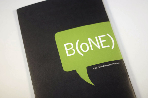
Work from Camlin:
Gutheinz’s:

FaceOut Books interviews Sanda Zahirovic about her fantastic Space Opera series designs. Nice.
(The interview itself is fairly straight-forward, but the books look fantastic.)


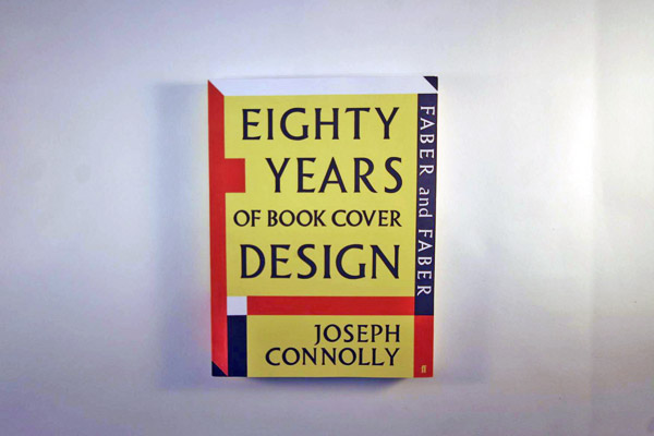
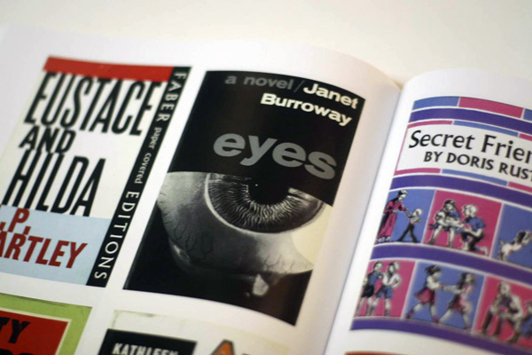
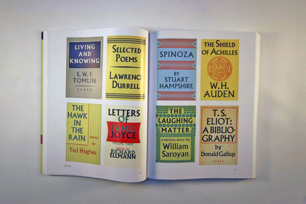
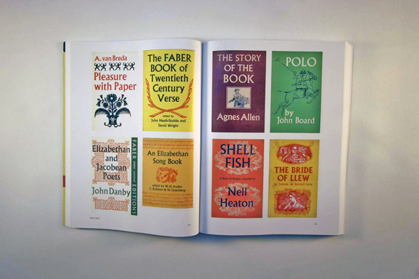
The new Faber and Faber: Eighty Years of Book Cover Design has hit the shelves in the UK.
They were kind of enough to send me a copy a couple weeks ago, so I’ve had some time to pour over this amazing resource. The short of it: make it a priority to pick it up. (Note that there are a couple independent sellers offering it up in the US. Also note that in the interim, you can check out Faber Book’s Flickr account, which updates fairly regularly.)
I count over 650 covers, many of them taking up a full page of the sizable 11″ format. The book doesn’t have much use for writing, packing each page with cover after cover. This dominance of design is wonderful, but it seems to have been done at the sake of handy indexing or cross-referencing. I may be spoiled by the ubiquitous hyperlinking of the Internet, but the fact that there is no way to reference a design or page to its designer is frustrating. The index is instead organized by surname, which is useless unless you know exactly who you’re looking for, and I’m just not that well-informed.
This apparent oversight is more than compensated for by the thoroughness and quality of the collection. There isn’t a page in the book that doesn’t contain something drool-worthy. All-in-all an inspiring and highly recommended experience.
Etymology: from Ancient Greek κολοφών (kolophon, “peak or finishing touch”)
-noun
col•op•hon [kol-uh-fon, -fuhn] (plural colophons)


If you follow design blogs at all, then you know the name Ian Shimkoviak. The guy is a whirlwind of opinions and comments. Henry Sene Yee posts a new cover? He’s got something to say about that. The Book Design Review has a question? Ian’s got an answer or five. While the incessant participation can wear thin on occasion, I can say with all honesty that I appreciate his enthusiasm and general attitude of respectful critique.
So let this be a public high-five to Ian, all you regulars out there should feel free to do the same (or not).
Also note that Shimkoviak is no slouch of a designer. You can check out his work at his personal site, or BookDesigners.com
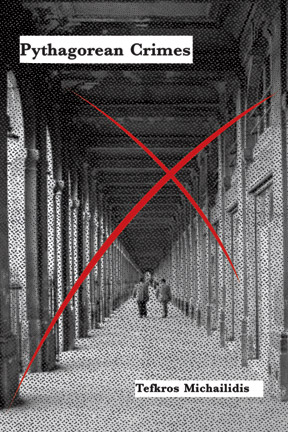
Design on the left by John Gall, design on the right by David Drummond. Both photos by Cara Barer.
- -
For previous episodes of This Looks Like That, see:
• Howard Grossman v. Modest Mouse
• Natalie Smith v. Portishead
• Me ripping off Edward Bettison
• Jamie Keenan v. Mark Melnick.
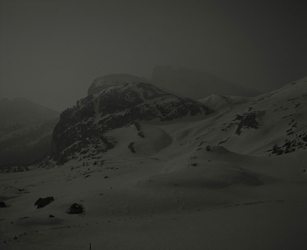
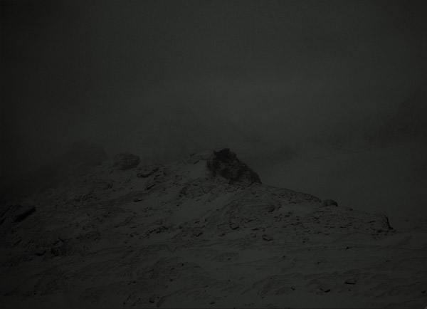
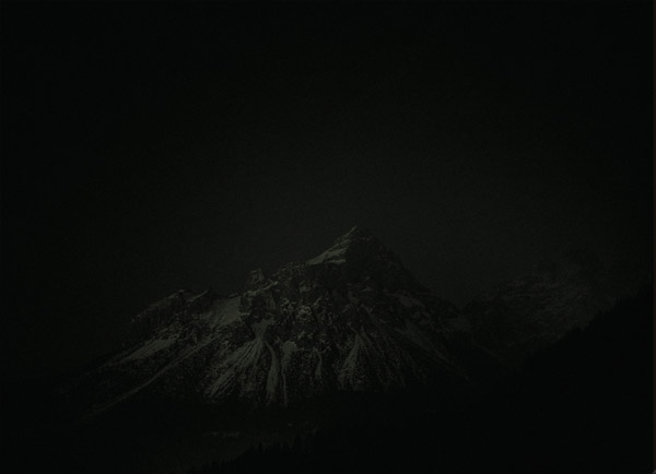
I recently posted Helen Yentus‘ cover for Peace, only to have her lay the smack down on me for not properly crediting the photographer, Michael Schnabel.
As it turns out, the photo used is from a series titled Stille Berge, or, Silent Mountains, and it’s absolutely gorgeous.
“Photographing the Alps in my own vision was a creative process that developed over years. One day – or night rather – it clicked. … The night and its silence gives the mountains a sublimity, feeling of raw creation and aloofness that I strived to capture in my work.”
I’ve posted a few from the series below, including the one used on Yentus’ cover.
Visit his site for the full series. (The site is a bit weird. Follow these directions: English (beware fullscreen popup) -> Work -> Waterscapes -> Stille Berg -> Show Set)


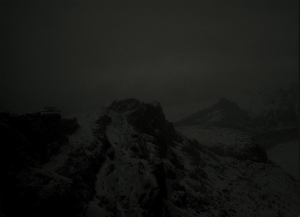
This should have been a book cover. The large field of color and playful use of photography makes it look like something Drummond would pull off.

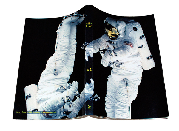
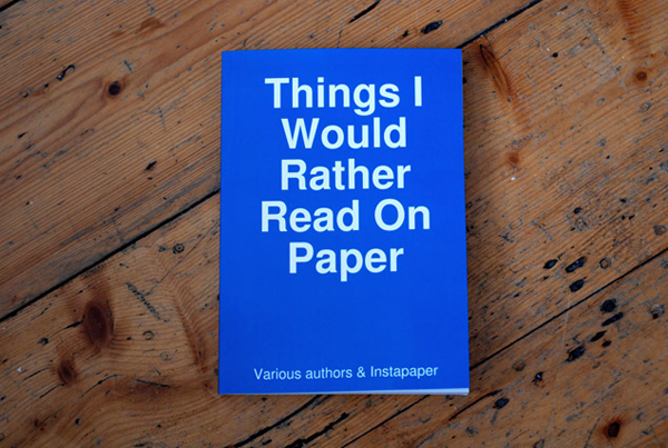
Two examples of people taking their favorite blog articles and printing them out (with nice covers!) via Lulu. As someone who’s mildly obsessed with the intersection of digital and mass production, I can’t tell you how much I love these. Click the images for more information on the respective books.
A handful of designers over at Design:Related are expressing their frustration with the AIGA’s decision to only select 41 covers for this year’s 50/50 competition.
The two main points of contention seem to be: (a) people paid good money to enter ($35-$50 per), so the AIGA has an implicit responsibility to keep its end of the deal, (b) to say that there were only 41 entries worth including is insulting at best and a slap in the face at worst.
Without seeing the actual entries or having been privy to the judging, it’s hard to weigh in with absolute conviction, but having kept pretty decent track of covers published in 2008 (188 in the Archive for last year alone), it does seem unlikely that there weren’t at least 50 designs worth highlighting. Also note that the designers expressing their frustration are no slouches. If talents such as Gregg Kulik, Henry Sene Yee, and Kimberly Glyder, to name a few, are expressing frustration, then you know something is amiss.
A representative of the AIGA has commented here before. I’d be interested to see if anyone can shed some light on this.