
Archive for March, 2009
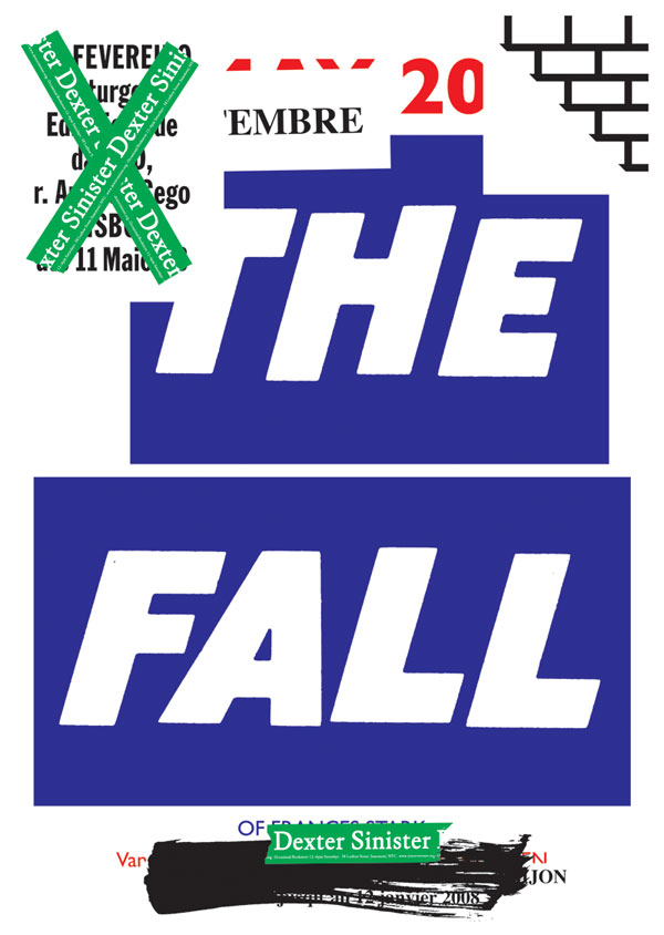
Dexter Sinister
Wednesday, March 25th, 2009I was reading a book on Heraldry last night for a logo client. Apparently the name of Dexter Sinister, your favorite bookseller and mine, comes from old heraldry terminology: Dexter means “right of the bearer of the arms, and to the left by the viewer’s eyes” of the shield, while Sinister means ” to the left of the bearer of the arms, and to the right by the viewer’s eyes”.
The More You Know™
Interview over at The Casual Optimist
Tuesday, March 24th, 2009One of my favorite sites, The Casual Optimist, just posted an interview he did with Eric and I. I won’t go so far as to say it’s worth reading, but there are worse things you could do with the next 5 minutes.
Eric had some good things to say about the state of the industry: E-book detractors have of a strange idea of what most books are. Those beautiful dusty old encyclopedias, that rare first-edition of Ulysses, even your fancy new Vintage paperback? That is not most books. The Grisham and Grafton paperbacks at the airport, Chicken Soup for the Spirit, college textbooks — that’s most books. Does anyone really care if the next Janet Evanovich thriller has no corporeal form? Wouldn’t that be an improvement?.

John Gall v. Corbis
Wednesday, March 18th, 2009One of my favorite covers of recent memory is John Gall’s design for Like You’d Understand, Anyway.
– Aesthetically, it just does it for me. NASA photo with a classic serif thrown on top. Orange reflective on a bright blue background. Just killer. (Do yourself a favor and ignore the kerning.)
– (Most of) the stories in the book deal with base human emotions within the context of extraordinary events. One of the short stories involves a love-struck female cosmonaut who walks around in a bright orange spacesuit. Whoever found the image did such an amazing job relating it to the content. Not only did it match the story line in a literal sense, but you’ve got a guy about to be propelled into space at 10,000miles an hour standing there like he’s wondering who’s gonna bring him a ham sandwich.
Anyway, going through the Corbis collection tonight for a project and ran across the source material. Turns out the color is all a sham. Which is equally awesome for entirely different reasons.


© H. Armstrong Roberts/ClassicStock/Corbis
1960′s Man In Silver Astronaut Space Suit And Helmet
Postscript:
- It’s a great book. Read it.
- Though I found the image through Corbis, the source is credited to ClassicStock.
New Think Thunked
Wednesday, March 18th, 2009I’ve seen a fair number of remarkable events at SXSW over the years, but I’ve never seen anything quite like what unfolded at the New Think for Old Publishers panel yesterday afternoon.
Let me be clear. Absolutely clear. Not one word spoken in that session, either from the panelists or from the audience, was new or innovative. The panel, well, we’ve all heard job descriptions before. The audience? That was one very long line of people saying the same things we’ve been saying to the publishing industry for ten years. And yet the publishing people treated our comments as if they were items to be added to a list. A list that will be filed in a drawer along with other conference ephemera.
“Maybe we should begin cultivating relationships with bloggers, or something”. Or something?
You can read the real-time reactions at Twitter #sxswbp. hat tip: Susannah Breslin


Design update
Sunday, March 15th, 2009We gave the Book Info page a bit of a facelift this evening. The information used to be a big jumble of design and publisher info, so we’ve split them into groups for more logical processing. Yay information architecture! (and apologies for the crappy structure you’ve been dealing with up to this point.)
Be sure and let us know if you have any suggestions for further improvements.


Chin-Yee Lai has a new site
Tuesday, March 10th, 2009The immensely talented Chin-Yee Lai has a new portfolio site. Expect to see a bunch of her stuff added to the Archive in the coming weeks.
I think I like her email announcement as much as I like her work, which is saying a lot.

are ee a dee a be oh o-kay
Tuesday, March 10th, 2009Good morning Tuesday. Slightly old but stuck in my head:
How Books Got Their Titles
Sunday, March 8th, 2009Moby-Dick was a real whale. In the nineteenth century sailors were in the habit of giving names to individual whales who were particularly dangerous or unkillable; among them were ‘Timor Jack’ and ‘New Zealand Tom’.
Great blog on how famous books got their titles, written for The Sunday Telegraph by Gary Dexter.
Shelved Books
Thursday, March 5th, 2009Book cover designer Kimberly Glyder has started an excellent new blog dedicated to Shelved Books. Concepts and comps that never made it to the store. Great work and an interesting read.
I love this unused design for The Error World:

BCA in The New Yorker (blog)
Thursday, March 5th, 2009[The Book Cover Archive's] creators have a discerning palate, and feast exclusively on beautiful covers.
Damn skippy.
Nice writeup of Megan Wilson‘s cover for Jane Eyre: A recent favorite: Vintage’s redesign of “Jane Eyre,” featuring Katherine Wollkoff’s dark photograph of a woman’s silhouette. The image alludes to the novel’s time period, when the silhouette was a form of portraiture. But it’s not a stiff, formal portrait: the woman’s hair is in slight disarray, and her facial features recede in the deep shadows of the photograph. It’s intriguing without giving away the story; to fill in what Jane looks like, you have to read the book.
book looks like a lady
Wednesday, March 4th, 2009
Well here’s an unexpected theme for a book cover blog: erotica authors Mathilde Madden and Kristina Lloyd are dismayed by the contradictory double-standard of erotic books written for (straight) women being wrapped with depictions of nude and semiclothed women.
(pictured: a rare instance of a male on a cover. Or possibly a chicken wing. In case you haven’t guessed, most of the rest of the site is not at all safe for work.)
We think their mission misses the mark, though; equal representation of men and women on book covers simply leads to equally bad book covers. Metaphor! Symbolism! Design! Forever!
via Slog