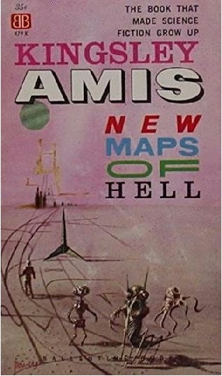
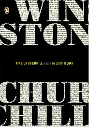
Let that be a lesson to you. 6 different font styles and still awesome.
(via io9)
Let that be a lesson to you. 6 different font styles and still awesome.
(via io9)
This isn’t a book cover, but it may as well be.
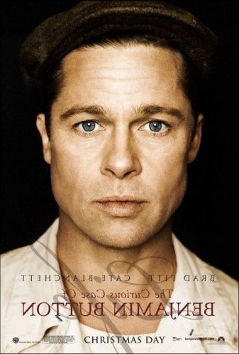
(In case you’re not familiar with the story, The Curious Case of Benjamin Button is the tale of a man who begins his life as an apparent septuagenarian and grows younger every year.)
A nice treatment from Juniper Grove:

And most interesting of all, Jonathon McNicol, the guy who manages Chip Kidd‘s website, has typeset the entire book and put it up for download as a PDF.
The whole thing kicks off with a beautifully typeset cover. Get the whole thing here.

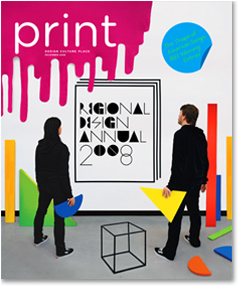
We finally got our hands on the Print Regional Annual.
MIDWEST:
↑ Art Director: Jill Shimabukuro
Design/Lettering: Natalie Smith
Photo: Robert N Davis Collection, the New York Public Library
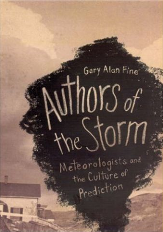
University of Chicago Press
↑ Art Director: Jill Shima
Designer: Isaac Tobin
University of Chicago Press
SOUTH:
↑ Art Director: Mark Ross
Designer: Mary Hooper
Thomas Nelson Publishers, Nashville
EAST:
↑ Art Director/Designer: Bryan Ashburn
Illustrator: Jesse Ewing
Quirk Books, Philadelphia

↑ Design Firm: High Design, Athens NY
Designer: David High
Photographer: Anna Beata Bohdziewicz
↑ Designer: Michaela Sullivan
Photographer: Jayne Hind Bidant
Houghton Mifflin Company, Boston
↑ Designer: Alex Camlin
De Capo Press, Cambridge MA
↑ Designer: Emily Gutheinz
The MIT Press, Cambridge MA
NYC:
↑ Designer/Illustrator: Rex Bonomelli
Photographer: Rick Fischer
Doubleday/Broadway
↑ Design Firm: Ben Gibson Studio, Brooklyn
Designer: Ben Gibson
Illustrator(s): Ben Gibson, Jonathan Bennett
Penguin USA
Mules and Men
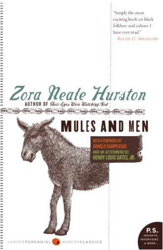
↑ Designer: Gregg Kulick
HarperCollins
↑ Art Director/Designer: Phil Falco
Illustrator: Drew Struzan
Scholastic
↑ Design: Julianna Lee
Little, Brown & Company
↑ Design: Henry Sene Yee
Picador
↑ Design Firm: Ben Gibson Studio
Design: Ben Gibson
Penguin
Nice macro shot of this one here
↑ Illustrator: Jennifer Wang
CD: Paul Buckley
Penguin
↑
Art Director: Henry Sene Yee
Illustrator: Christoph Neimann
Picador
↑ Art Director: Roseanne Serra
Designer: Jennifer Wang
Penguin
Great book.
↑ Art Director: Paolo Pepe
Designer: Joe Montgomery/Wednesday design
Photographer: Andrew K Davey
Bantam Dell
↑ Art Director: susan mitchell
Designer: Charlotte Strick
Illustrator: Margaret Cusack (She specializes in textile illustrations!)
Farrar, Straus & Giroux
(Best image we could find sorry)
↑ Art Director/Designer: Anne Twomey
Photographer: Elizabeth Watt
Hachette Book Group
↑ Designer: Paul Sahre
Photographer: Michael Northrup
Hachette Book Group

↑ Art Director: Susan Mitchell
Designer: Jennifer Carrow
Farrar, Straus & Giroux
↑ Creative Director: Paul Puckley
Designer/Illustrator: Daniel Clowes (fun fact: Clowes did a lot of the illustration for OK Soda)
Series Concept: Helen Yentus (our credit, not Print’s)
Penguin
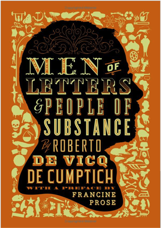
↑ Men of Letters & People of substance
Design Firm: De Cicque Design
Design: Roberto de Vicque de Comptich
David R Godine
↑ Art Director: Darren Haggar
Designer: Christopher Brand @ Rodrigo Corral Design
Penguin
↑ Design Firm: gray318
Designer: Jonathan Gray
Art Director: Darren Haggar
Penguin
↑ Design: Flag
Photographer: Ian Lloyd / Masterfile
Hachette Book Group
↑ Art Director: Paolo Pepe
Design: Roberto D Vicque
Photagrapher: McDermott and McGough
The Dial Press
↑
Art Director: Susan Mitchell
Illustrator: Charles Burns
Farrar, Straus & Giroux
The big winner? Design Related. My goodness who isn’t on that site these days?
Apparently he’s got an honest-to-gawd, irony-free, hard-boiled detective novel coming soon. “Conversational Reading” has an excerpt.
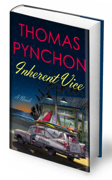
So let me get this straight… “The Goddamned” Frank Miller designed an edition of Gravity’s Rainbow, but when Pynchon writes a real noir novel we get this?
Oh dang.
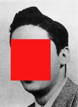
Make sure you read the part about his ghost/celebrity sighting of Thomas Pynchon.
*cough*increaseyourtypesizeplease*cough*
Gesundheit.
(via Books Covered)
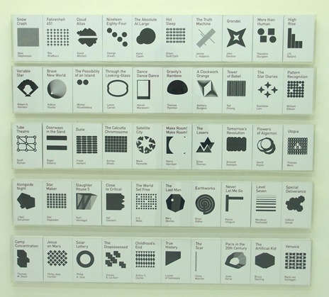
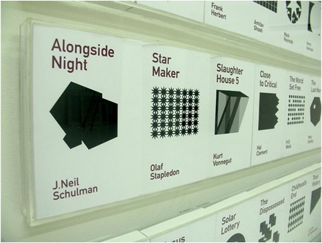
Designer Heman Chong has taken it upon himself to redesign the covers of SciFi classics. It’s a subject that’s close to our hearts, so we’re more critical than we would be otherwise.
We applaud the effort, and in theory we love what he’s done here, but the final product comes up a bit short. We love DIN as much as the next design nerd, but the type seems half-again larger than it needs to be, and the geometric shapes are great, but the majority of them don’t relate back to the story in any decipherable way and seem to be little more than decoration. Maybe that’s the point? Hard to say without a concept statement of any sort.
Either way, it’s a great effort and we’d love to see more of this kind of thinking. Check out the full set at his website.
(via vvork)
At some point in the last couple months, Sam Potts updated his site and no one told us.
As I’m sure is the case for a lot of people, Potts came to our attention through his work on the Brooklyn Superhero Supply Co.
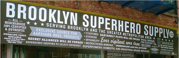
Surprise of all surprises, he’s done a bunch of other solid work. Here’s a small handful, filtered for contextual appropriateness:


And now you know.

Japanese book covers from Grain Edit
Kenneth Whyte, editor in chief of Macleans magazine, has an interesting writeup of the cover design process for his latest book, The Uncrowned King: The Sensational Rise of William Randolph Hearst.
Passionate about the topic and frustrated with the solutions being provided to him by Random House, he goes from passive to obsessed, refusing to promote the book unless the cover gets to a point where he’s happy with it. Ultimately, he concedes and accepts the design provided by RH’s in-house staff.
Covers matter. At Maclean’s magazine, we sell between 7,000 and 21,000 copies a week on newsstands, and the most obvious variables week to week are the cover subject, the cover image, and the cover line, which means that when we nail a cover, we can sell three times as many copies as when we don’t.
…
I offered my editor a long but polite list of suggestions for alterations to her proposed covers. … It wasn’t long, however, before I was drafting designers of my acquaintance in Toronto, Montreal, and New York to produce alternatives to what I was now referring to as “the atrocities” coming out of the Random House art department.
…
My assistant said, “I bet they hate you at Random House, but I guess you’re used to that.”
The final design, put out by Random House Canada:

We can’t say we blame him for his frustration. The provided cover isn’t exactly inspiring or inspired. For someone used to dealing with the high-impact, competition-laden world of the magazine rack, we can see how it would appear muddled and clumsy. We count three images, 3 typefaces, five font-styles and outlined text, all of which varies slightly between browns and greys. The images used are ambiguous, providing a hint of more information but not really delivering on the promise, providing a lot of noise for little payoff.
We prefer the cover put out by Counterpoint publishing for the same book. There’s not much to it, but at least the tone looks important and on the level with similar titles about Carnegie, J.P. Morgan, or Rockefeller.

(via ffffound)
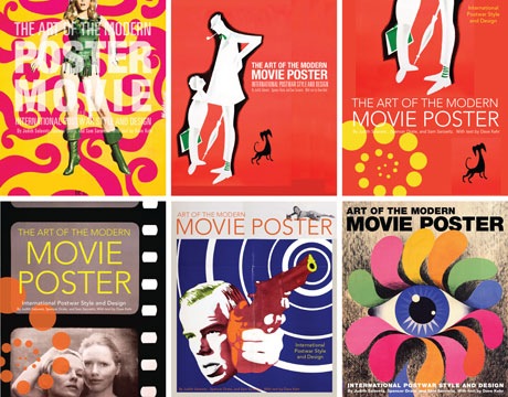
The Chronicle Books Blog has a nice writeup about the cover design process behind one of their latest design books, The Art of the Movie Poster.
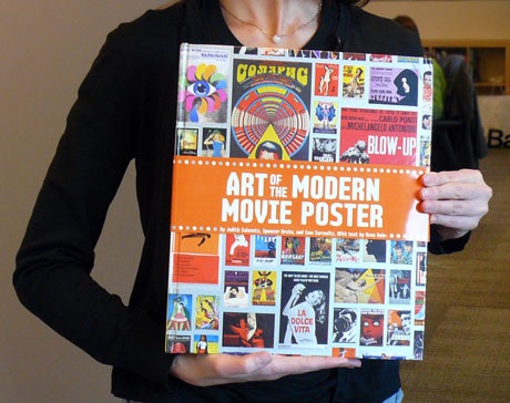
The one on the bottom right is our favorite:
(via The Strange Attractor)
