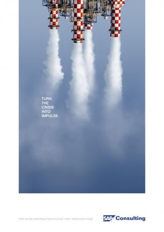
This should have been a book cover. The large field of color and playful use of photography makes it look like something Drummond would pull off.
This should have been a book cover. The large field of color and playful use of photography makes it look like something Drummond would pull off.
July 7th, 2009 by Pieratt
true… true.
People! Google “Book Cover Design Blogs”. This thing is getting way out of control. I’m all for freedom of speech but this market is more saturated than a governmental TARP. I liked it better when no one knew how or where book covers were designed “sigh”. The gig of promoting of one’s self through the guise of “information” is UP!
Ahhh. Mr. Peters drops the same line on all book cover design blogs. Why don’t you stick to the ones you like and support them with constructive comments.
Fact is that this blog and all the ones you post on have been around for about the same amount of time and all the recent new ones are bringing a whole new fresh aspect to them.
Mr. Shimkoviak, it’s Mrs. Peters. And please stop stalking me…
HI..
The info provided in your site is more useful to us..
Thanks a lot
keep going more..
I liked the way u put up the content on the site. I would like to visit this site too often…. U have done a great job and really hats off for wat u have done. Keep it up
I agree that this has the personality to be a book cover. I think that the bright colors and use of imagery with the smoke makes this an interesting photo to look.