The Kansas City Library parking garage:

(via The Denver Egotist)
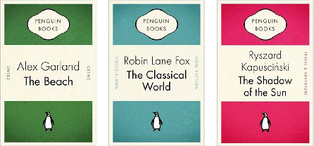
I’m obsessed with the Gollancz/Orion “Future Classics” collection. UK SF Book News has an interview with Gollancz editor Simon Spanton on the series.


I’ve had no luck figuring out who exactly was behind these covers (beyond “the Orion Books Art Department”). Can any UK readers who have gotten their filthy mitts on them help?
A similar Space Opera collection is coming out sometime in 2009! I’ve got space-ants in my space-pants.
These Awesome Tapes of Africa look like something that would go well with a Sedaris or McSweeney’s collection. (Via Draplin)


They also remind us quite a bit of the Going On video for Gnarls Barkley.
io9 has posted some ultimate awesomeness for your enjoyment.

Maud Newton put together a nice summary of e-reading options for the iPhone.
Items of note:
- Randomhouse just started offering free book downloads for Stanza.
- Interesting to see that the an iPhone displays about as many characters as a Kindle. Of course the iPhone doesn’t have the nice E-Ink® flatness of the Kindle or the 800×600 resolution. But still, surprising.
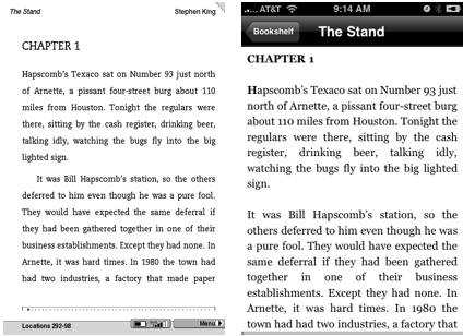
I have yet to try reading an eBook of any sort, but I have to admit they’re starting to make it fairly appealing. How about you guys? Given the context of this blog I have to admit I feel bad even considering the option. It won’t be long before book cover designers are going to have start worrying about how their designs work with a z-axis and basic tweening .
(via Casual Optimist)
Science fiction novelist Jane Lindskold is posting some thoughts on her history with book cover design.
I’m going to start with my first novel, Brother to Dragons, Companion to Owls, cover art by Rowena… [it] depicts a blond young woman wearing jeans and a baggy harvest gold sweater. She is curled asleep amid stark rocks. She is cuddling a green stuffy toy that just might be a two-headed dragon. To the sides, wispy smoke forms of a dragon and an owl are shown. The lettering is white and very cursive. … The story is completely urban. No rocky landscapes. For another, the dragon is rubber and blue. For a third, the book deals with street gangs, hackers, and genetic experimentation.
She describes this as the cover that “I think may have seriously hurt my career“:

A couple weeks earlier, she posted a few thoughts on Why Fantasy and SF series are the girl everyone wants to date, but no one wants to take home to mother. Now, granted, she was referring to the critical reception of series sci-fi/fantasy vs stand-alone books, but I think her question should be expanded to the entire genre. Her post reminded of this quote from Nick Hornby in the Believer:

Even buying Iain M. Banks’s Excession was excruciating. Queuing up behind me at the cash desk was a very attractive young woman clutching some kind of groovy art magazine, and I felt obscurely compelled to tell her that the reason I was buying this purple book with a spacecraft on the cover was because of the Believer, and the Believer was every bit as groovy as her art magazine.
There’s the challenge, book publishers. Produce science fiction covers that won’t ruin Nick Hornby’s chances of getting laid.
The Typophile forum is running an activity/competition/challenge to design a book cover based on a randomly generated phrase from Wikipedia, art from the Life magazine archives, and (of course) awesome typography. There’s some good work here!

Nice interview with one of the industry’s more interesting designers working today.
Things seem to go pretty fast for me, at least for the first round. Maybe half a day for a couple of comps. For some books like that dog book I mentioned, I’ll read the manuscript and just let it stew for a couple of weeks. When I do start comping-up an idea, I kind of engage in brutal self-editing and ditch ideas that don’t work. If I feel I am forcing an idea, that is an indication that I should move on.
I remember an interview I saw with an actor on Actors Studio where he said you have to be willing to embarrass yourself when trying things out for a scene. I think that is true in design as well. I sometimes come up with an idea and think, “Naaahh, they won’t go for it.” I almost always send it and don’t really mind if they think, “What the hell is this?“ If it feels a little wrong, it’s probably right.
P: how come the UK gets all the nice series
J: fwiw, the paper and binding is usually inferior
P: on a uk book?
J: yeah, I read a whole article about it a few years back
J: you can always tell which books are UK in the Powell’s remainders.
P: you should post that on the blog

v.

Sorry for the crappy cell phone picture. The advertisement says “Hungry? Like a wolf?”
The Walter-Tiemann-Award was first presented at 1992 and since than has been awarded every other year. This award primarily recognizes the design achievements of typographers and illustrators. The art contest addresses those, who outside the established publishing houses create room for innovations and enthusiastically carry through their ideas of artwork.
Some beautiful stuff this year:
Photo by Florian Hardwig.

View all the winners at the official site. And this nice Flickr set.
Lots of bad news for book publishers. Houghton Mifflin Harcourt is on the skids, and Random House is experiencing a big shake-up. How much of this really stems from the larger, recently exposed economic problems, though? Has any publisher been thriving in the past decade?
The Book Design Review points us at a nice article at GOOD Magazine about the importance of book design, which has an even nicer quote from James Gleik from an interview with the the NY Times: “Go back to an old-fashioned idea: that a book, printed in ink on durable paper, acid-free for longevity, is a thing of beauty. Make it as well as you can. People want to cherish it.”
BoingBoing thinks this is wrong in all sorts of ways: “In the same way the internet has forced newspapers into a ‘news vs. paper’ moment, the publishing world is in a ‘readers vs. book lovers’ moment. In this environment, the single most important choice anyone in publishing has to make is this: ‘How many generations do I want to be in business?’ Because hawking Ye Olde Codices to aging connoisseurs is a one-generation business.”
We think they’re both right. It’s not a mutually-exclusive issue. You can embrace new media and treat your books as design objects. If the hundreds of imprints and countless genres have taught us anything, it’s that book readers like variety.
John Gall was kind of enough to send in some photos from the recent We Love Books world tour, which featured Randomhouse Art Directors John Gall, Chip Kidd, Barbara DeWilde and Carol Devine Carson.
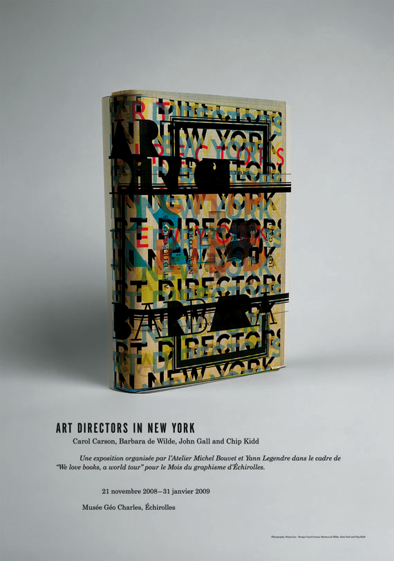
Poster designed by Gall.
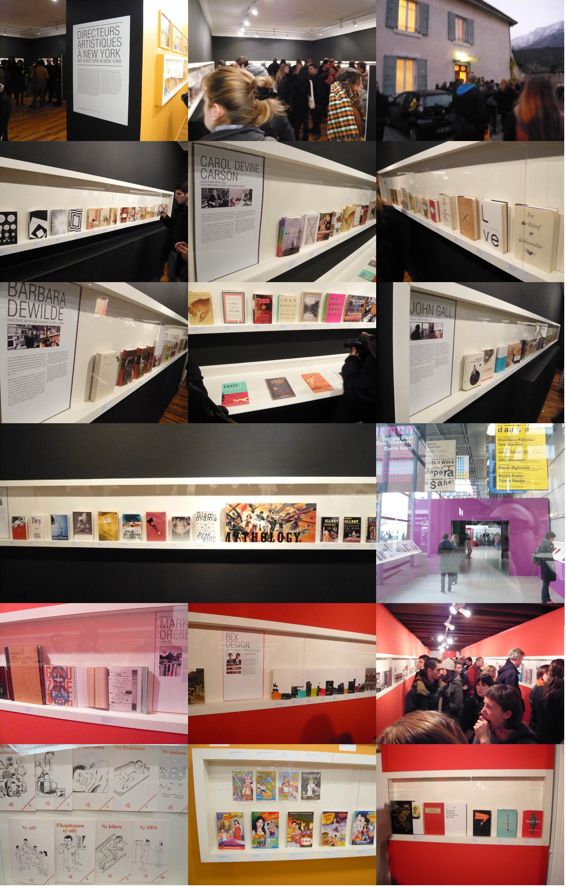
Click the images for more.