Archive for the ‘Uncategorized’ Category

Christopher Tobias

Thursday, September 3rd, 2009

A couple notes on Christopher Tobias:

- Just added his new cover for Age of Wonder. Art Directed by Jonathan Sainsbury & Brian Barth. The type sold me.

- You’ve probably already seen his new blog: Group Thinkery, “An ongoing discussion of books, design, & publishing”. It reads like a teacher’s lounge for cover designers.

- I’m not sure when he redesigned his site, Outerwear For Books, but it’s easily one of the nicest book cover portfolio presentations I’ve seen. Really loving the simplicity (shame that it’s done in Flash, though).

Black Jack/et Mechanical

Monday, August 24th, 2009

Peter Mendelsund is giving away the full set (all 16) of Black Jack titles over at his blog. The catch? You have to help design them.

Go Go Go.

Cover design on Twitter

Tuesday, August 18th, 2009

I thought it would be handy to compile a list of book cover design related twitter accounts. I’m probably missing some good ones, so consider this a working list. I’ll try and update the main post with any suggestions that come in.

Blogs:
The Book Design Review: @thebdr
The Book Cover Archive: @coverarchive
FaceOut Books: @faceoutbooks
Design Related: @DesignRelated

Other:
(me) Pieratt: @pieratt
Dan Wagstaff: @danwagstaff

Designers:
Henry Sene Yee: @hsyee
Sam Potts: @sampotts
Ian Shimkoviak @thebookdesigner
Kimberly Glyder @kglyder
Christopher Tobias @outerwear4
Jason Gabbert: @gabbertj
Ingrid Paulson: @ingridpaulson
Wilhelm Stahle: @wilhelmstaehle
Peter Mendelsund: @mendelsund
Karen Templer: @karentempler
Chip Kidd: @chipkidd
Roberto de Vicq: @rdevicq
JR Caines: @JRCainesDesign

Nice new blog – Book Worship

Monday, August 17th, 2009

Book Worship – a new blog full of graphically interesting, but otherwise uncollectible, books that entered and exited bookstores quietly in the 50s, 60s, and 70s.

Guaranteed to have your neck at a 45º angle for the rest of the day.

1984 pt.2, “Victory Gin All Around”

Friday, August 14th, 2009

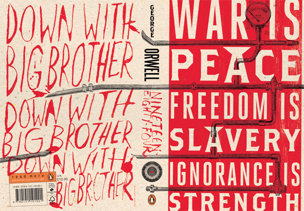
Alan Trotter offers up a bit of back story behind the aforementioned 1984 redesign.

Last year I was a copywriter at Penguin and wrote a lot of blurbs for the Classics lists. So you get used very quickly to seeing your words on books by some of the greatest writers who ever lived. The job was a joy from start to end and there’s not a lack of things it was a thrill to be able to work on.

And was kind of enough to show off the full jacket.

1984_full_jacket

That back panel is serious business.

More Great Ideas, and the Gettysburg Address

Friday, August 14th, 2009

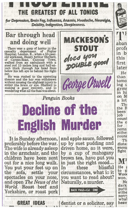
Another handful of Great Ideas IV covers have been added. Almost at the complete set now.

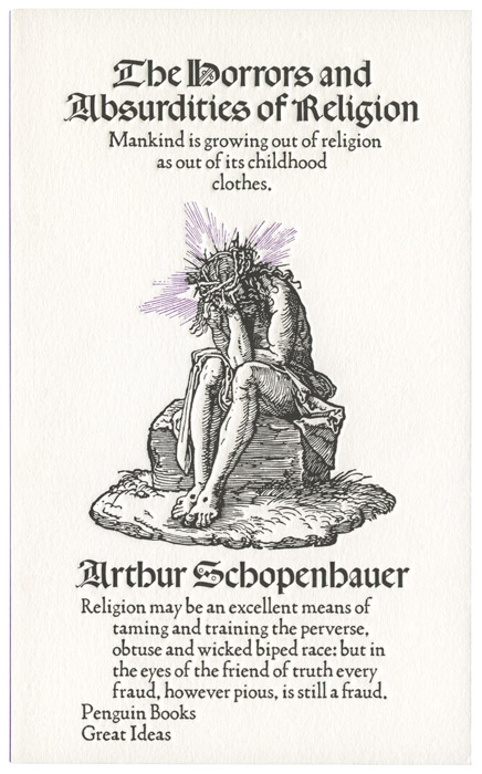
Also wanted to note that David Pearson (lead designer of the Great Ideas series) has been completely forthcoming about the specific sets of reference points that he’s pulled from for this series. Specifically from Great Ideas IV, the covers for The Gettysburg Address and The Horrors and Absurdities of Religion pull from a poster by Maciej Zbikowski, and a piece of Albrecht Dürer (no image, sorry), respectively.

zbikowski_lincoln

Penguin Great Ideas IV

Thursday, August 13th, 2009

David Pearson was kind enough to send over the first ten of the new Great Ideas IV designs, photographed and ready to be ogled. The project as a whole is down to the final 30 titles. Ten more for IV, then the final twenty in the fifth series, which will be released in 2010 just in time for Penguin’s 75th birthday.

I asked Pearson if he had any notes or thoughts on this latest batch, and he had this to say:

The formula is now so familiar to us that the main struggle is really an internal one and that’s for us to move the series somewhere new each time. Across this many titles each cover has to be distinct enough to maintain interest and – I hope – the boundaries we originally set ourselves have allowed enough flexibility to do this.

..There will always be a part of me that feels slightly sheepish at having produced so many of these things (80 so far) but much more so, I feel incredibly lucky to be working on a project that taps into the very specific skills I do have (and not the myriad that I do not).

Cheers David.

See the latest ten covers in the series here.

greatideas_iv_lincoln
greatideas_iv_orwell
greatideas_iv_schopenhauer

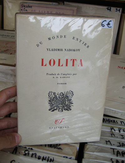
Du Monde Entier, Lolita cover

Tuesday, August 11th, 2009

Gorgeous.

lolita-cover

(Can’t remember what site I nabbed this from, sorry.)

Freedom is Slavery: 1984 by Gray138, then me

Monday, August 10th, 2009

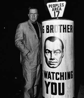
The Book Design Review recently posted up Jon Gray‘s new Australian Penguin UK cover for 1984. Like Mr Sullivan, it’s probably my favorite to date. Though I have to say this isn’t saying much since I dislike most every treatment out there. I’ve always felt that any overt design for this title was too much, and the closest thing to the mark that I’ve seen are the graphics done for the original 1955 movie. Authoritarian, utilitarian, and ultimately, a bit rude. In an effort to put my money where my mouth is, I’ve taken a quick stab at what I’d like to see on the shelves, (see below).

1984_movie

Director Edmond O’Brien, on set.

1984_gray318
Jon Gray’s cover for an unknown Australian publisher Penguin UK.
pieratt_1984

My sketch. (Note that I worked on top of one of Darren Haggar‘s excellent photos completely without his permission.)

(Thanks to Alan Trotter for letting me know that I was way off on the publisher info.)

The Hugo Awards get a logo

Monday, August 10th, 2009

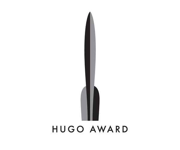
A couple months ago the Hugo Awards opened themselves up to a logo competition. They’d never had an official seal or emblem to put on their award winning books and were looking to change that. The judges were promising: Irene Gallo, Art Director at Tor, Neil Gaiman, and Chip Kidd.

The winner was announced yesterday, and I’m pleased to say that it’s completely decent. Neither overtly geeky nor horribly tacky, it is very understated and a bit Art Deco. Curious as to how they plan to implement a mark with such vertical proportions onto book covers, etc, but the quality of the logo itself gives me every confidence that they’ll figure it out.

I would encourage you to read more except that there’s really no details to share at this point.

hugo_logo

Thanks for the headsup, Eric.

How do you use the Book Cover Archive?

Friday, August 7th, 2009

Over the course of the next several months, we’re going to be making some new additions and improvements to the site. We have a number of things lined up, but it would help us immensely if we had a better sense as to our audience’s expectations and habits.

A couple questions for you:

– How do you use the Archive? (for instance, do you simply check out the front page occasionally, or do you dive deep into meta data categories?)
– What additions would you like to see?
– What parts of the Archive are driving you nuts?
– Any other notes you’d like to make?

That’s it. We certainly appreciate it.

Design:Redux

Friday, August 7th, 2009

I’m sure you’ve all noticed this already, but Design:Related seems to have drastically improved their server situation. The site cruises now. A big improvement from last month when you could find me whining about it.

Kudos to the D:R team for the upgrade.

The Work of Gabriele Wilson

Thursday, August 6th, 2009

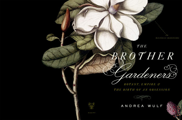
I’ve just added a whole slew of work by Gabriele Wilson. It’s been a long time coming and I’m very pleased with all the additions.

A couple specific notes from Gabriele on textiles:

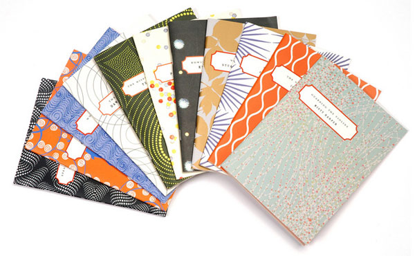
The Poetry Society of America Chapbooks: textiles come from everywhere. It’s a combination of textiles that I have found, some I have drawn or created myself, a good amount are from Textile Designs by Susan Meller and Joost Eiffers, many are wallpaper and fabric samples that I have collected, and more recently the illustrator Leanne Shapton and the English textile designer Neisha Crosland gave us use their textile designs.

The Edith Wharton textiles were found art that are meant to look as close as possible to the original text’s endpapers.”

You can see more of Gabriele’s work at her Design:Related page.


gabriele_wilson_chapman


gabriele_wilson_brothers_gardener

Thor Sene Yee

Tuesday, August 4th, 2009

Henry Sene Yee‘s got a great new cover and blog post about his design for Last Last Chance. Seeing the source material for his inspiration on such an original design is a rare privilege.

just make it geometric

Wednesday, July 29th, 2009
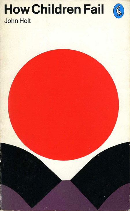
how-children-fail

fun shapes via Nevver