Mendelsund over at FaceOut Books

(Yeah, we make a lot of posts about Mendelsund. Wanna fight about it?)

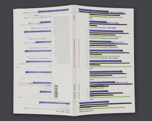
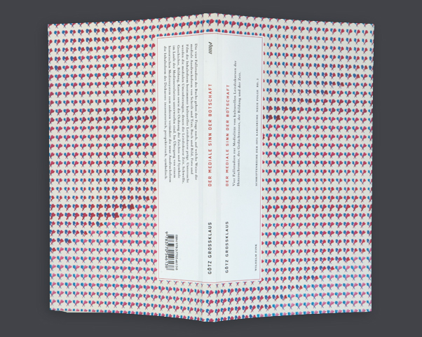
The excellent FaceOut Books has a new entry up wherein they interview Peter Mendelsund about his work with Vertical Press.

Interview Highlights:
- Scratch & Sniff cover
- Lots of glorious images by Mendelsund and others (Gall, Mark Melnick, etc)
- Treatment of manga that isn’t retarded.
- Reading about the budgetary compromises and restraints that Mendelsund has to deal with.

A couple ancillary notes:
- Don’t miss the fact that a lot of the images have mini-navigations above them. I didn’t see it the first time around.
- Cool to see FaceOut Books using the Cargo Collective platform. We haven’t seen it used in this kind of blog format before.

April 16th, 2009 by Pieratt   |   1 Comment »

Science and Tech Ads

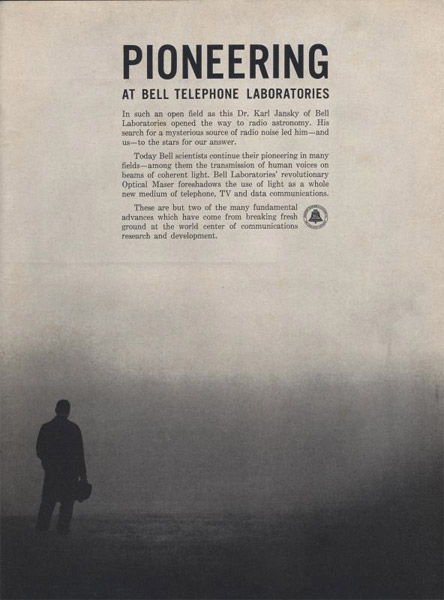
Do yourselves a favor and spend a spell over at the amazing Science and Tech Ads collection, (nabbed from Draplin during my daily DDC tractor pull).


Reminds me of Kidd™’s cover for The English Patient, (one of my favorite covers of all time).

bca_science_english_patient

April 13th, 2009 by Pieratt   |   1 Comment »

Paul Sahre’s AIGA talk now online

Paul Sahre’s AIGA/NY A Designer and His Problems talk is up on Vimeo. Haven’t watched it yet. Something to look forward to.

Thanks to Sam PottsTwitter feed for the headsup.

April 13th, 2009 by Pieratt   |   1 Comment »

Mendelsund’s quest for T&A (no really)

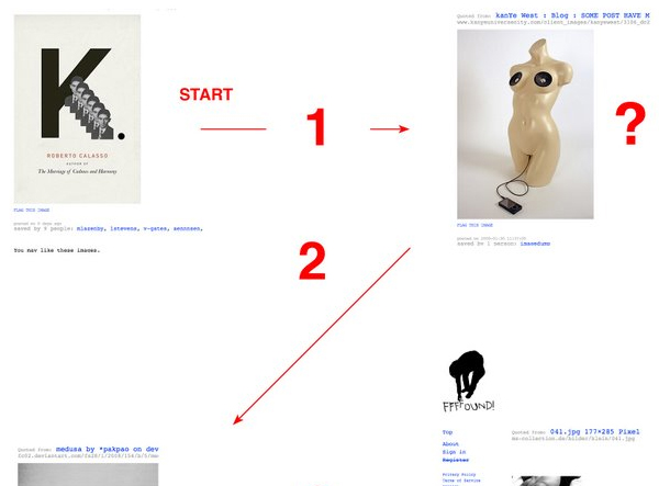
Peter Mendelsund tracks down how many clicks it takes to get from one of his covers to a picture of a naked woman on ffffound.com:

I’ve been a big fan of the popular website FFFFOUND! since it’s inception. The site is chock-filled with interesting design, curated (for the most part) by users with wide-ranging visual interest and impeccable taste. … Here’s the rub: this associative system invariably leads me, without my knowing it, to an image of a naked lady.

Of course the write-up is accompanied by an infographic.

mendelsund_ffffound

The whole thing is pretty hilarious. Read the full write-up here. (His blog doesn’t allow deep-linking, so you’ll just have to scroll down a bit.)

- – -

Also, as a bit of self-whoring here, General Projects has a small utility which allows you to download the images in anyone’s ffffound account to your hard drive: ddddownload.com. It’s not the fastest service in the world (works on a queue system), but it works!

April 10th, 2009 by Pieratt   |   2 Comments »

“Mo-Books”

“Mo-books (this is how I call e-books for mobile devices)” says author Nick Podpisany, (you guys can thank me for not title this entry “Mo Books Mo Problems” later). Nick just wrote in saying:

I am a tech-fiction writer. This is my e-book, which is supposed to be a first one dedicated to users of mobile devices. What might be interesting for you is that a cover was designed specifically to look great on a screen of an iPhone.
I’ve designed the cover myself having in mind 5 goals to achieve:

• to keep the proportions of the iPhone screen
• to design in RGB mode, not CMYK mode – it opens the mind in terms of using much brighter colours
• to use iPhone-specific design elements – f.e. the middle oval flash
• to have black as a dominant colour – by this the book cover could actually become a part of the iPhone front
• to refer to the iPhone’s tech clean style – being at the same time a good illustration of the idea of the book itself

Password Incorrect

(read more about his book here.)

It’s an interesting question.
Do covers need to be designed differently for mobile devices? I suspect not. Book covers are already designed to catch a buyer’s eye from across the store, so reducing them in size shouldn’t detract from their poster-qualities.

Case in point:

mobile book covers

Though I will say that designing covers in RGB would be a nice non-constraint.

April 10th, 2009 by Pieratt   |   No Comments »

Christopher Brand

You may have noticed that I’ve been posting a lot of Christopher Brand stuff to the Archive lately. This is because he has a portfolio site now. Chris has worked with Paul Sahre and Rodrigo Corral, is currently at Penguin Books, and is just way too talented for his own good.


April 9th, 2009 by Pieratt   |   1 Comment »

The Smell of Books

Time to give up on the whole paper book industry. It’s over, stick a nail in it and call it a day. Smell of Books has overcome the last remaining barrier to widespread e-book adoption, and it comes in “crunchy bacon.”

April 2nd, 2009 by Eric Jacobsen   |   2 Comments »

March 30th, 2009 by Pieratt   |   No Comments »

Dexter Sinister

I was reading a book on Heraldry last night for a logo client. Apparently the name of Dexter Sinister, your favorite bookseller and mine, comes from old heraldry terminology: Dexter means “right of the bearer of the arms, and to the left by the viewer’s eyes” of the shield, while Sinister means ” to the left of the bearer of the arms, and to the right by the viewer’s eyes”.

The More You Know™

March 25th, 2009 by Pieratt   |   No Comments »

Interview over at The Casual Optimist

One of my favorite sites, The Casual Optimist, just posted an interview he did with Eric and I. I won’t go so far as to say it’s worth reading, but there are worse things you could do with the next 5 minutes.

Eric had some good things to say about the state of the industry: E-book detractors have of a strange idea of what most books are. Those beautiful dusty old encyclopedias, that rare first-edition of Ulysses, even your fancy new Vintage paperback? That is not most books. The Grisham and Grafton paperbacks at the airport, Chicken Soup for the Spirit, college textbooks — that’s most books. Does anyone really care if the next Janet Evanovich thriller has no corporeal form? Wouldn’t that be an improvement?.

March 24th, 2009 by Pieratt   |   No Comments »

March 23rd, 2009 by Pieratt   |   No Comments »

John Gall v. Corbis

One of my favorite covers of recent memory is John Gall’s design for Like You’d Understand, Anyway.

– Aesthetically, it just does it for me. NASA photo with a classic serif thrown on top. Orange reflective on a bright blue background. Just killer. (Do yourself a favor and ignore the kerning.)

– (Most of) the stories in the book deal with base human emotions within the context of extraordinary events. One of the short stories involves a love-struck female cosmonaut who walks around in a bright orange spacesuit. Whoever found the image did such an amazing job relating it to the content. Not only did it match the story line in a literal sense, but you’ve got a guy about to be propelled into space at 10,000miles an hour standing there like he’s wondering who’s gonna bring him a ham sandwich.

Anyway, going through the Corbis collection tonight for a project and ran across the source material. Turns out the color is all a sham. Which is equally awesome for entirely different reasons.


© H. Armstrong Roberts/ClassicStock/Corbis
1960′s Man In Silver Astronaut Space Suit And Helmet

Postscript:
- It’s a great book. Read it.
- Though I found the image through Corbis, the source is credited to ClassicStock.

March 18th, 2009 by Pieratt   |   3 Comments »

New Think Thunked

I’ve seen a fair number of remarkable events at SXSW over the years, but I’ve never seen anything quite like what unfolded at the New Think for Old Publishers panel yesterday afternoon.

Let me be clear. Absolutely clear. Not one word spoken in that session, either from the panelists or from the audience, was new or innovative. The panel, well, we’ve all heard job descriptions before. The audience? That was one very long line of people saying the same things we’ve been saying to the publishing industry for ten years. And yet the publishing people treated our comments as if they were items to be added to a list. A list that will be filed in a drawer along with other conference ephemera.

“Maybe we should begin cultivating relationships with bloggers, or something”. Or something?

You can read the real-time reactions at Twitter #sxswbp. hat tip: Susannah Breslin

March 18th, 2009 by Eric Jacobsen   |   No Comments »

March 17th, 2009 by Pieratt   |   No Comments »

Design update

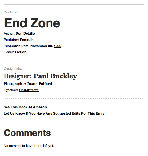
We gave the Book Info page a bit of a facelift this evening. The information used to be a big jumble of design and publisher info, so we’ve split them into groups for more logical processing. Yay information architecture! (and apologies for the crappy structure you’ve been dealing with up to this point.)

Be sure and let us know if you have any suggestions for further improvements.

March 15th, 2009 by Pieratt   |   No Comments »