“Mo-books (this is how I call e-books for mobile devices)” says author Nick Podpisany, (you guys can thank me for not title this entry “Mo Books Mo Problems” later). Nick just wrote in saying:
I am a tech-fiction writer. This is my e-book, which is supposed to be a first one dedicated to users of mobile devices. What might be interesting for you is that a cover was designed specifically to look great on a screen of an iPhone.
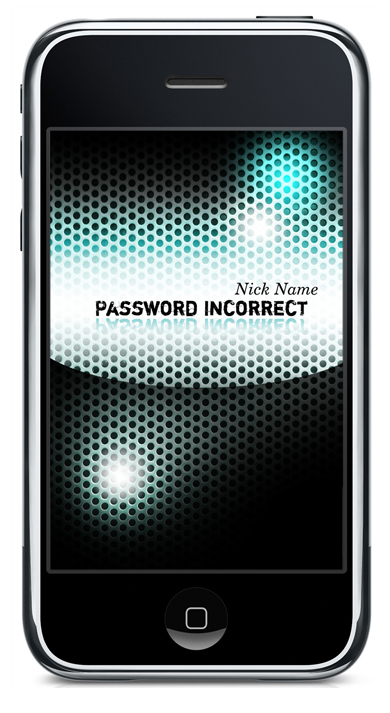
I’ve designed the cover myself having in mind 5 goals to achieve:• to keep the proportions of the iPhone screen
• to design in RGB mode, not CMYK mode – it opens the mind in terms of using much brighter colours
• to use iPhone-specific design elements – f.e. the middle oval flash
• to have black as a dominant colour – by this the book cover could actually become a part of the iPhone front
• to refer to the iPhone’s tech clean style – being at the same time a good illustration of the idea of the book itself

(read more about his book here.)
It’s an interesting question.
Do covers need to be designed differently for mobile devices? I suspect not. Book covers are already designed to catch a buyer’s eye from across the store, so reducing them in size shouldn’t detract from their poster-qualities.
Case in point:

Though I will say that designing covers in RGB would be a nice non-constraint.