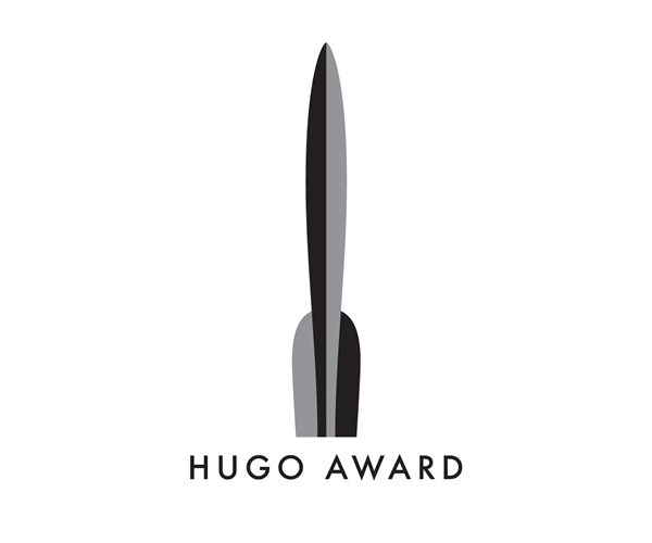
A couple months ago the Hugo Awards opened themselves up to a logo competition. They’d never had an official seal or emblem to put on their award winning books and were looking to change that. The judges were promising: Irene Gallo, Art Director at Tor, Neil Gaiman, and Chip Kidd.
The winner was announced yesterday, and I’m pleased to say that it’s completely decent. Neither overtly geeky nor horribly tacky, it is very understated and a bit Art Deco. Curious as to how they plan to implement a mark with such vertical proportions onto book covers, etc, but the quality of the logo itself gives me every confidence that they’ll figure it out.
I would encourage you to read more except that there’s really no details to share at this point.

Thanks for the headsup, Eric.
nice. who made it?