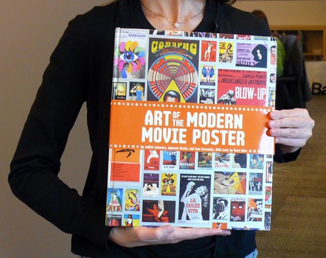
The Chronicle Books Blog has a nice writeup about the cover design process behind one of their latest design books, The Art of the Movie Poster.

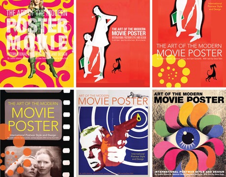
The one on the bottom right is our favorite:

The Chronicle Books Blog has a nice writeup about the cover design process behind one of their latest design books, The Art of the Movie Poster.

The one on the bottom right is our favorite:

November 23rd, 2008 by Pieratt
That bottom right cover was Chronicle Books designer’s favorite cover as well. But in discussions with others, some felt it was too obscure, pegging the book too much in the 60′s, and failing to convey “movie” and/or “poster.” It definitely stands out…
Suzanne – thanks for the response!
I don’t think we would have argued that it was the right choice for the final product for the same reasons that you’ve already stated, we’re just exercising our rights as the Completely Uninvolved to nitpick and provide unsolicited preference.