Archive for the ‘Uncategorized’ Category

Austen of the Dead

Wednesday, January 28th, 2009

Elizabeth was surprised, but said not a word. After a silence of several minutes, he came towards her in an agitated manner, and thus began: “In vain I have struggled. It will not do. My feelings will not be repressed. You must allow me to tell you how ardently I admire and love you, and your sweet, delicious braaaaiiiins.”

9781594743344_large

Pride and Prejudice and Zombies is the original text of Jane Austen’s Victorian classic with “all-new scenes of bone-crunching zombie action,” complete with 20 new illustrations drawn in the style of the original illustrator.

Yes, this is a real book.

Rekindle

Tuesday, January 27th, 2009

Kindle v2 is coming on Feb 9. Some photos were leaked last fall, but it’s possible that the design has improved since then. Rumored improvements include better better “page turning.”

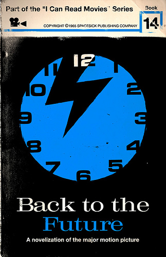
I can read movies

Tuesday, January 27th, 2009

You’ve probably seen Olly Moss’s movie poster project, part of his “make something cool every day” challenge. Spacesick has responded with a series of faux-vintage novelizations of modern movies.

3228382703_0fe1c3ccbd

Keep making cool!

Two shots of Espresso Book Machine®, please

Tuesday, January 27th, 2009

The Espresso Book Machine will print, bind, and trim a 300-page book in less than four minutes. Production cost is a penny a page and minimal human intervention is required for operation. The trim size of a book is infinitely variable between 8.5” x 11” and 4.5” x 4.5” and the EBM Version 2.0 can bind up to 830 pages.

One more time: The Espresso Book Machine will print, bind, and trim a 300-page book in less than four minutes for a penny a page. Holy *@#&. John Klima over at Tor has a nice write up of his experience with the EBM. The results aren’t flawless, but they’re certainly impressive.

His article also points us to a great interview with Clay Shirky, author of Here Comes Everybody, wherein he predicts the future of media. His thought on the future of books (a) scares the crap out of me (b) seems completely on point (c) makes me think of Neil Stephensen’s The Diamond Age:

The book world is more secure. I think the big revolution is going to be print on demand. Imagine only having one browsing copy of every book in a bookstore. You could say “Malcolm Gladwell’s Outliers looks good”, and out pops a brand new copy. Why does a bookstore or a publisher have to be in the shipping and warehousing business?

Tuesday, January 27th, 2009

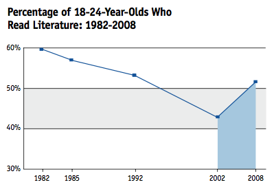
While we’re busy fretting about the future of books, here’s a little good news: contrary to popular opinion, reading is up. Everyone is reading more, across all ages, demographics and ethnicities.

picture-3

Graph, news shamelessly stolen from Chris Pearson.

Yes Studio and the Penguin on Design series

Monday, January 26th, 2009

If you follow design blogs at all, you’ve undoubtedly seen the new Penguin on Design series, designed by Yes Studio. And for good reason, they’re gorgeous.

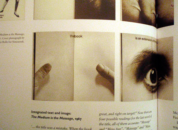
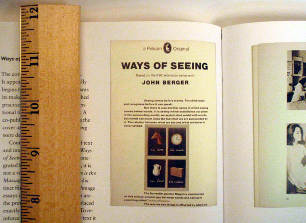
What I haven’t seen, however, is any mention of the original work that these covers are referencing. The design for The Medium is the Massage, for instance, is taken directly from one of the interior spreads of the original book, designed by Quentin Fiore. While Ways of Seeing is a basic rehash of the cover that’s existed in one form or another for 30 years. Artwork by Magritte, design by Richard Hollis.

As for the other two, I know that the pictographs on Munari’s book come from his own collection of work, and I have no idea what the Sontag photograph is from (need to read that one yet.) A bit’o'trivia, though: John Gall named On Photography as the most “meaningful [book] to his development as a creative person”. Read up on that and a whole list of other designer’s favorite books here.


Photos from Phil Baines’ Penguin by Design.

Salinger’s design clause

Sunday, January 25th, 2009

Two of my favorite covers of all time come from The Catcher in the Rye. The great white space, the nice typography, and ultimately the utter respect for the text.

I only recently read up on how Salinger had a clause in his contract which limited his covers to Title and Author only. Dot Dot Dot had a nice write up on this, though unfortunately they don’t seem to credit their source:

In the 1950s Salinger had a clause put in his publisher’s contracts that insisted only the text of the title of the book and his name were to appear on any future editions of his work, and absolutely no images. This hard line was particularly prompted by an early fatal experience with a publisher who covered a collection of short stories, then titled for Esmé – with Love and Squalour (after one of them) with a dramatic illustrated portrait of a seductive blonde. Salinger’s outrage is understandable: his Esmé is a precocious young girl of seven, and the story depicts a chance encounter and redemptive conversation with a solider on the verge of a nervous breakdown. Nevertheless, it’s instructive to see how various publishers and nationalities have dealt with Salinger’s legal one-liner over the past half-decade of reprints and new editions.


Great War Dust Jackets

Saturday, January 24th, 2009

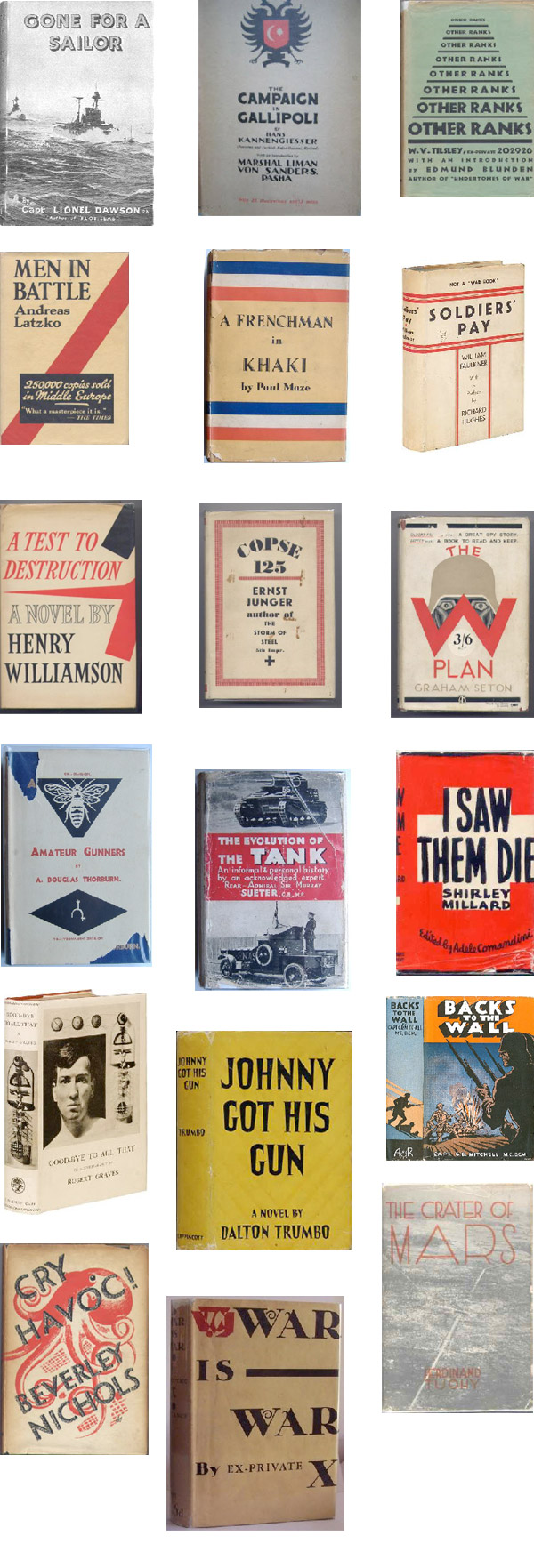
[Great War Dust Jackets] is designed to show dust jackets from books relating to The Great War published between 1914 & 1939.

We spent most of the morning noodling around this staggering collection. Some of our favorites:

Great War Dust Jackets

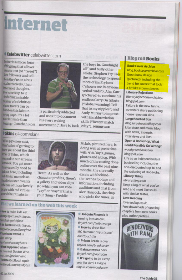
Book Cover Archive in Today’s Guardian

Saturday, January 24th, 2009

Alan Hewer of Great War Dust Jackets (see above) emailed us this morning to let us know the Book Cover Archive was mentioned in this morning’s issue of The Guardian. Nice!

Also note Sanda Zahirovic‘s cover for Rendevous with Rama there in the corner.

bca_guardian

I miss having time to be bored (aka. The End of Print)

Thursday, January 22nd, 2009

via Andrew Sullivan

Le Book Emissaire

Wednesday, January 21st, 2009

I can’t find the source for this, sorry.

David Gee

Monday, January 19th, 2009

Last we saw of David Gee, he had gotten his start in book cover design with his work on Showbiz (see below). Apparently the guy’s been busy since then. We just added a small pile of his work to the archive. He’s also got a blog that he updates semi-frequently.

Thanks to Nate Salciccioli for the headsup.


Who’s Watching the Mike Essl?

Saturday, January 17th, 2009

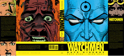
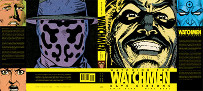
You may or may not be sick to death of news related to Watchmen. Fortunately for you, overexposure doesn’t make Mike Essl any less of a bad ass. So do yourself a favor and go a read an interview with Essl about the design process behind the new book.


(Photo via the AIGA Flickr pool)
(Cover images via Chip Kidd™’s collection of work.)

This looks like that #4

Saturday, January 17th, 2009

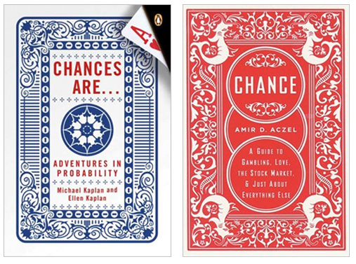
Cover design for Chances Are by Jamie Keenan
Cover design for Chance by Mark Melnick
(We give this one to Keenan because of the nice Penguin logo implementation.)

This looks like that part the third

Saturday, January 17th, 2009

Cover design for The Country of the Blind by Edward Bettison.
Cover design for Orthodoxy by Ben Pieratt.
(Bettison’s came first.)