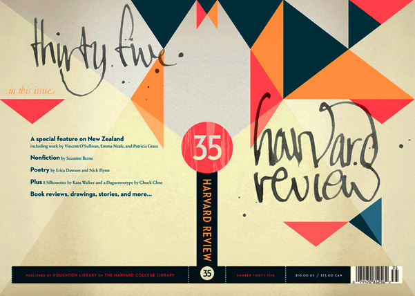
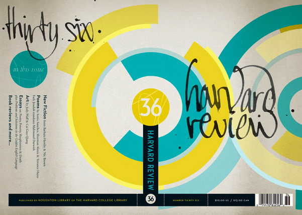
As someone who’s in Cambridge on an almost daily basis, I’ve been meaning to post this for a while now. Alex Camlin has outdone himself with this ridiculously nice redesign for The Harvard Review, a semi-annual(?) literary magazine out of ole’ Crimson.
The new covers are printed on a nice, toothy uncoated stock, and the books are bound with printed endpapers that repeat the pattern and color of the issue number (circle) that wraps around the spine.
Looking forward to seeing where he takes future editions.


drooool
so fresh, smart, and full of life.
love them!
Oh wow…this is just the thing I wanted to wake up today. Amazing job.
[...] Uncoated Stock — The chaps at The Book Cover Archive pointed me to the design:related portfolio of Alex Camlin, Creative Director at Da Capo Press. His [...]
This new design is brilliant, a pleasure to look at. Well done, Alex Camlin!