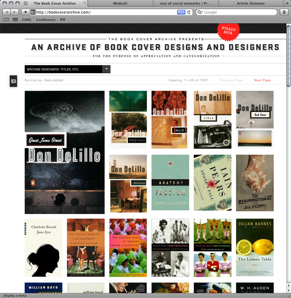
The most recently posted book on the front page of the Archive is now called out a bit more from the others. The idea being to call more attention to new entries instead of throwing new work into the abyss and hoping someone notices. It’s a design decision I stole from my old blog that I’ve been meaning to implement for a while now.
Big thanks to Yentus for reminding me that our current design was lacking.
Also note that if you guys have any thoughts or feedback on other design improvements we can be making, we’d love to hear them. Either email me (ben [at] general-projects.com) or feel free to comment below.

Hi, I would love to navigate trough book cover when I’ve ever clicked on a picture…
Previous and next page button are grey and not functionnal.
Seb – thanks!
We agree completely and its definitely something we plan to implement in the future. The coding is kind of weird, though, so its going take a bit of effort before that feature is included.