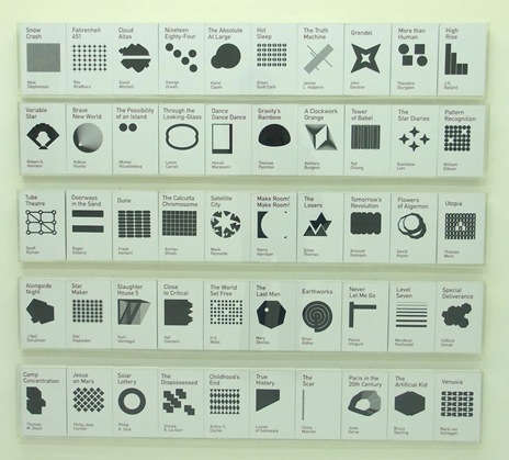
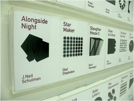
Designer Heman Chong has taken it upon himself to redesign the covers of SciFi classics. It’s a subject that’s close to our hearts, so we’re more critical than we would be otherwise.
We applaud the effort, and in theory we love what he’s done here, but the final product comes up a bit short. We love DIN as much as the next design nerd, but the type seems half-again larger than it needs to be, and the geometric shapes are great, but the majority of them don’t relate back to the story in any decipherable way and seem to be little more than decoration. Maybe that’s the point? Hard to say without a concept statement of any sort.
Either way, it’s a great effort and we’d love to see more of this kind of thinking. Check out the full set at his website.


(via vvork)